Coronavirus Data Analysis with python in easy way
Hi, there hope you all are safe and doing something productive in these quarantine days.
today I am back with a very interesting topic of 2020 that is data analysis.
today I am back with a very interesting topic of 2020 that is data analysis.
today we'll analyze the cases of coronavirus over the world.

Important Note
In this tutorial I am personally using jupyter notebook in my laptop but but if you don't have that much powerful laptop or you don't know how to setup jupyter notebook no worries I already taken care of you just visit the link below a jupyter notebook hosted on google cloud opens in front of you.
the part of exploring different features of this notebook I'll leave it on you and you can watch tutorials on youtube to speed up the learning process.
Important packages to install
ok, guys, let's get back to work below python packages are very important for this tutorial if you are using jupyter notebook offline install all packages mention below but if you're using it online from the link above just install package number 2 and 3 how to do that just copy-paste below lines in the shell one by one...
1. pip install pandas
2. pip install geopandas
3. pip install descartes
4. pip install matplotlib
5. pip install request
done with this part lets move ahead......
Initialize packages
ok now lets import all the packages we had installed just type...
import pandas as pd
import geopandas as god
import descartes
import matplotlib.pyplot as plt
import requests
if any error occurs please let me know in the comment section with a proper screenshot then or at StackOverflow.
if no errors great job lets begin the real game...
Initializing the variables
Now, let's fetch the data of covid19 first to do that.....
we'll initialize three variables namely confirmed_cases, recovered_cases and death_cases taking fresh and updated CSV from Johns Hopkins University Github repository.....
confirmed_cases_url = "https://raw.githubusercontent.com/CSSEGISandData/COVID-19/master/csse_covid_19_data/csse_covid_19_time_series/time_series_covid19_confirmed_global.csv"
recovered_cases_url = "https://raw.githubusercontent.com/CSSEGISandData/COVID-19/master/csse_covid_19_data/csse_covid_19_time_series/time_series_covid19_recovered_global.csv"
death_cases_url = "https://raw.githubusercontent.com/CSSEGISandData/COVID-19/master/csse_covid_19_data/csse_covid_19_time_series/time_series_covid19_deaths_global.csv"
Reading with pandas
now we will read CSV files fetched by variables vie pd.read_csv() function.
here we created three data frames namely df_confirmed, df_recovered and df_deaths...
df_confirmed = pd.read_csv(confirmed_cases_url)
df_recovered = pd.read_csv(recovered_cases_url)
df_deaths = pd.read_csv(death_cases_url)
Viewing the data
after doing this much work I am pretty much sure that you were interested in seeing how the data is stored inside these data frames so let's check it out
In python, we have three ways to see data
1. head() → to see the first 5 rows of the table in the data frame we write...
2. tail() → similarly, to see the last five lines we write...
df_confirmed.tail()
3. name → to see entire data we use just write the data frame name...
df_confirmed
Task: Try the above three things with df_recovered and df_deaths.
Additional stuff...
ok let's explore some more cool python function commonly used in data analysis
1. suppose someone asked you whats the matrix of a particular data frame here the matrix is nothing but the number of rows and columns. we use shape function for that so we can easily find it by writing...
df_confirmed.shape
output:
(264, 88)
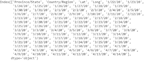
2. if you were just interested in finding out how many columns or heading are there is a data frame just write...
df_confirmed.columns
Melting the columns
now before we move ahead lets first see what melting is actually like an ice cube when it melts the water drops fell vertically on the ground in similar fashion in a table when we convert rows into columns we call it melting now clear...
in the above image, you can clearly see we have four main columns in Green Province/State, Country/Region, Lat, Long, and the Red ones are just dates now the question is can't we make the fifth column which contains all these dates so data visualization become much easier the answer is yes just type...
confirm_df = df_confirmed.melt(id_vars=['Province/State','Country/Region','Lat','Long'])
output:
Woh! we just did it now we have all our dates in a single column with corresponding values...
Woh! we just did it now we have all our dates in a single column with corresponding values...
Renaming
now we have successfully melted our data but the fifth and sixth column names are not looking so good to me lets change the variable to date and value to confirmed.
we can do it by just typing...
confirm_df.rename(columns={'variable':'Date','value':'Confirmed'},inplace=True)
confirm.tail()
output:
take a glance at the columns we have just changed the variable to date and value to confirmed.
Joining
isn't it is good instead of calling confirm, death recovered again and again if we can club them together in a single file and call that file to see entire data yaa it can be possible.
in the code below we will join all three data frames together inside a final_df variable to do this just type...
final_df = confirm_df.join(recovered_df["Recovered"]).join(deaths_df["Deaths"])
see the columns we have successfully merged all three CSV files together.
Plotting
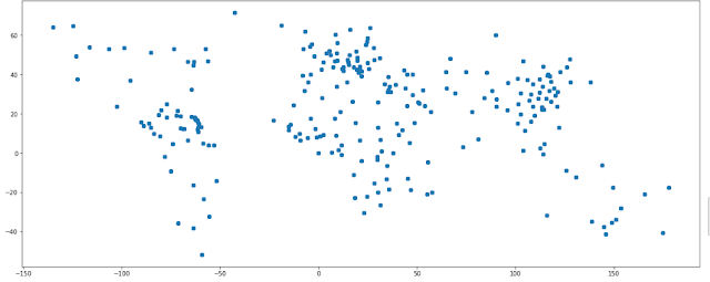
till now we have just seen our data in table format now its time to see it visually by just typing...
gdf01 =god.GeoDataFrame(final_df,geometry = god.points_from_xy(final_df['Long'],final_df['Lat']))
gdf01.plot(figsize=(20,10))
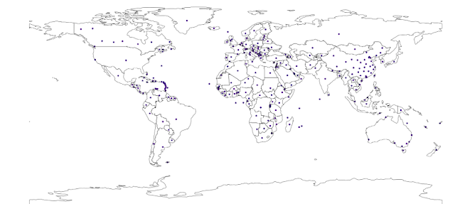
this plotting is not looking much appealing as we have covid19 data of world lets try to plot this data on a world map.
first, load the world map by typing the following...
world = god.read_file(god.datasets.get_path('naturalearth_lowres'))
ax = world.plot(figsize=(20,10))
ax.axis('off')
now we'll plot the points on the world map we can do by typing...
fig,ax =plt.subplots(figsize=(50,20))
gdf01.plot(cmap='Purples',ax=ax)
world.geometry.boundary.plot(color=None,edgecolor='k',linewidth=1,ax=ax)
ax.axis('off')
finally, we did it together this is my first blog on data visualization practical,
to get the full code visit ...
GitHub:- https://github.com/Lalitsingh5522/Covid19
let me know if you want more tutorials like this or a topic of your choice...😊
to get the full code visit ...
GitHub:- https://github.com/Lalitsingh5522/Covid19
let me know if you want more tutorials like this or a topic of your choice...😊
Thanks!!! for Visiting Asaanhai or lucky5522 😀😀


